MarshallVapes
MarshallVapes is a Vancouver-based Shopify ecommerce store selling vape products and essentials. I led the storefront UX and conversion improvements across the homepage, collection browsing, merchandising components, and checkout readiness. The goal was to reduce time-to-product, increase trust, and improve completed orders as the business scaled past 1,000+ sales and $50,000+ revenue.
Product Definition
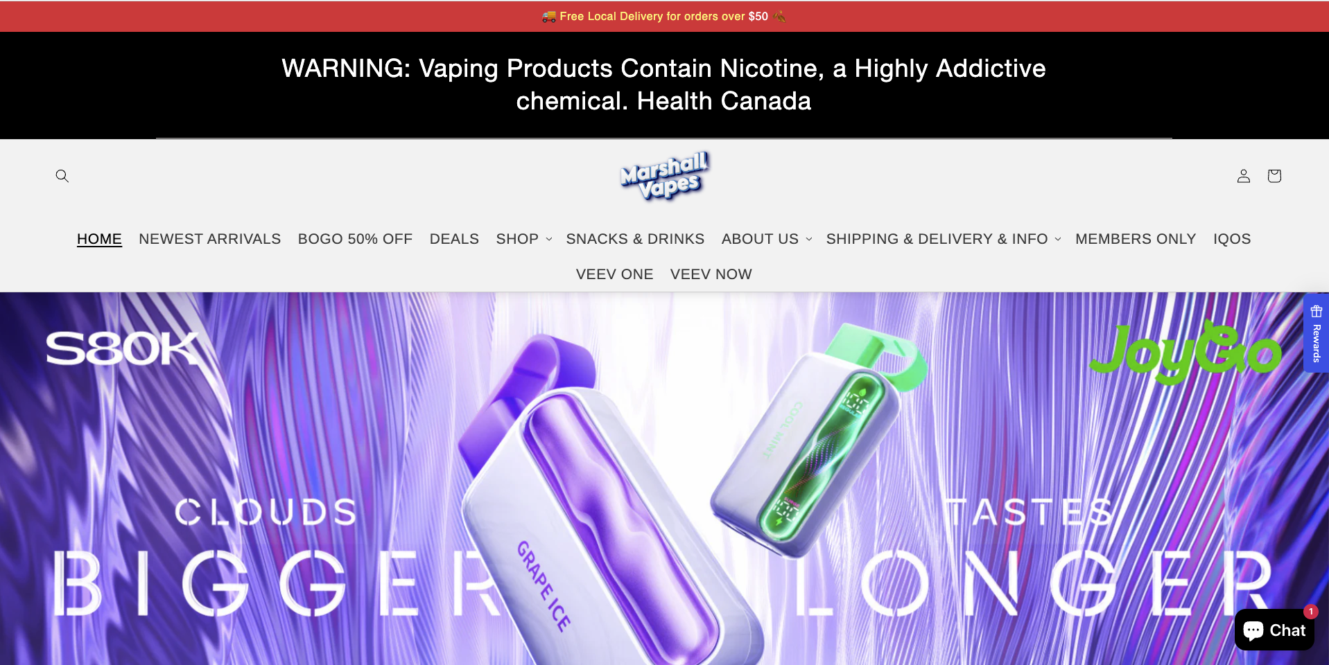
Mapped the core customer journeys, returning customers shopping by product format, and new customers browsing deals and essentials. Prioritized fast discovery, promotion clarity, and trust signals above the fold.
Information Architecture and Layout
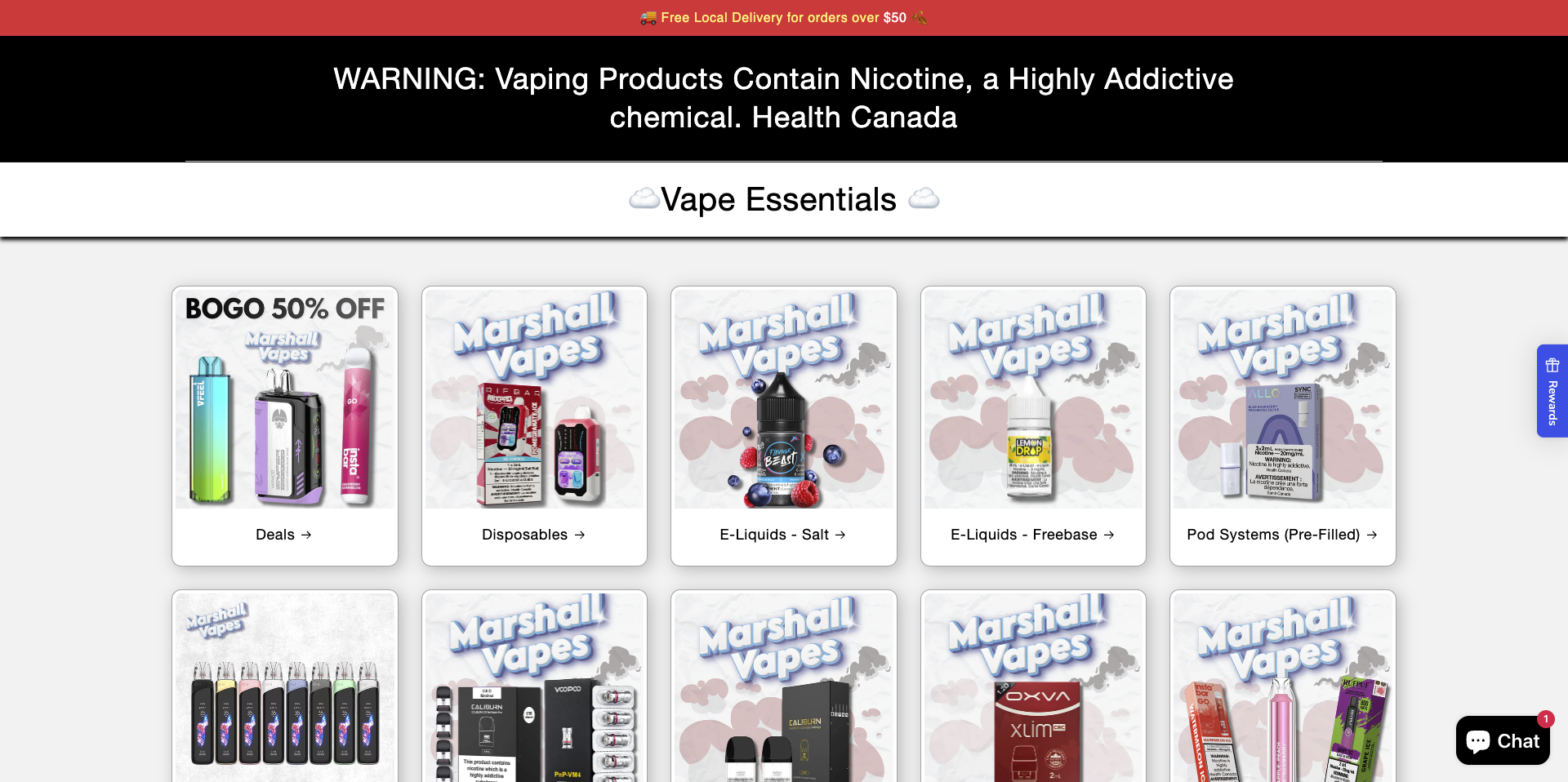
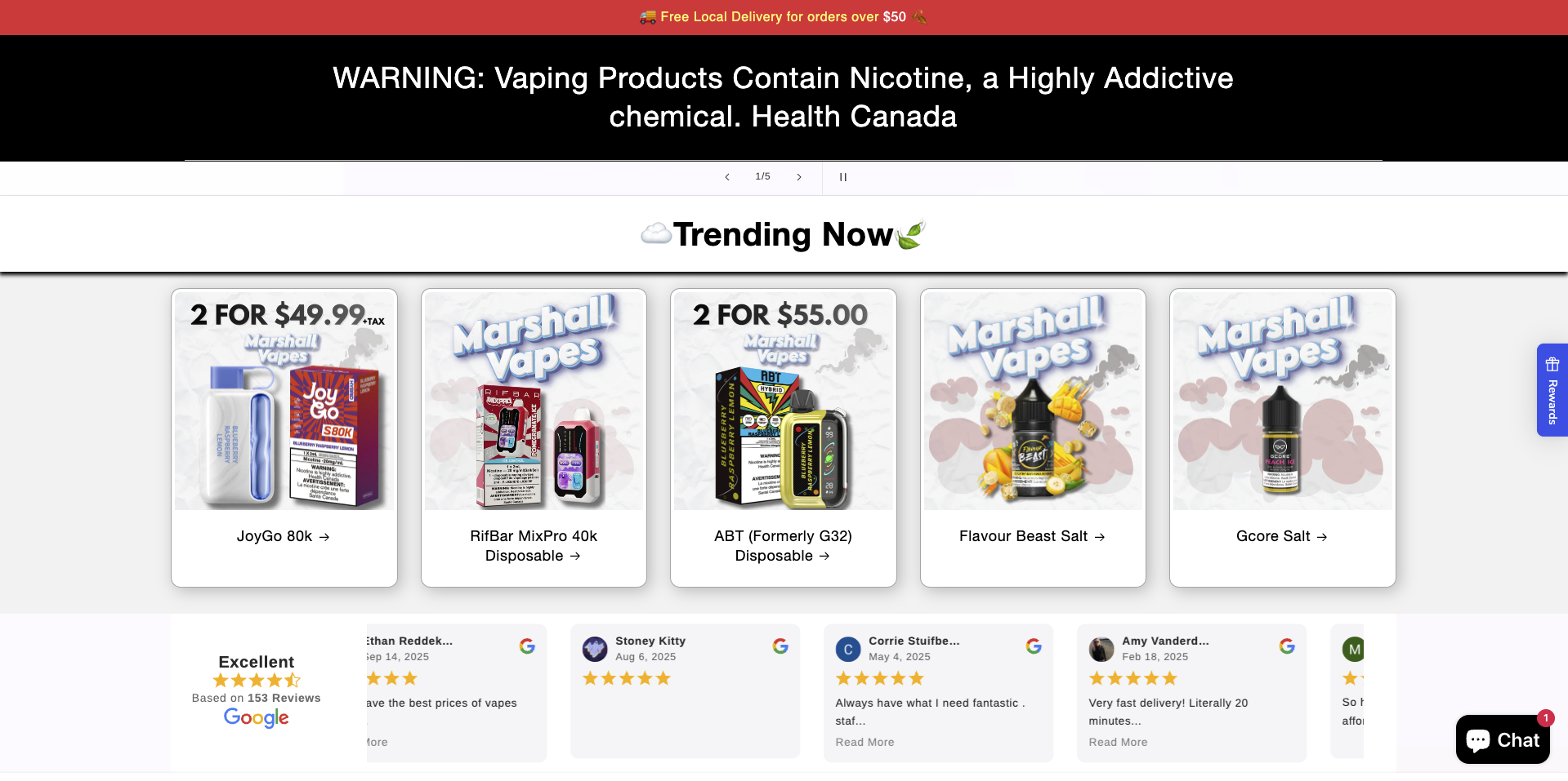
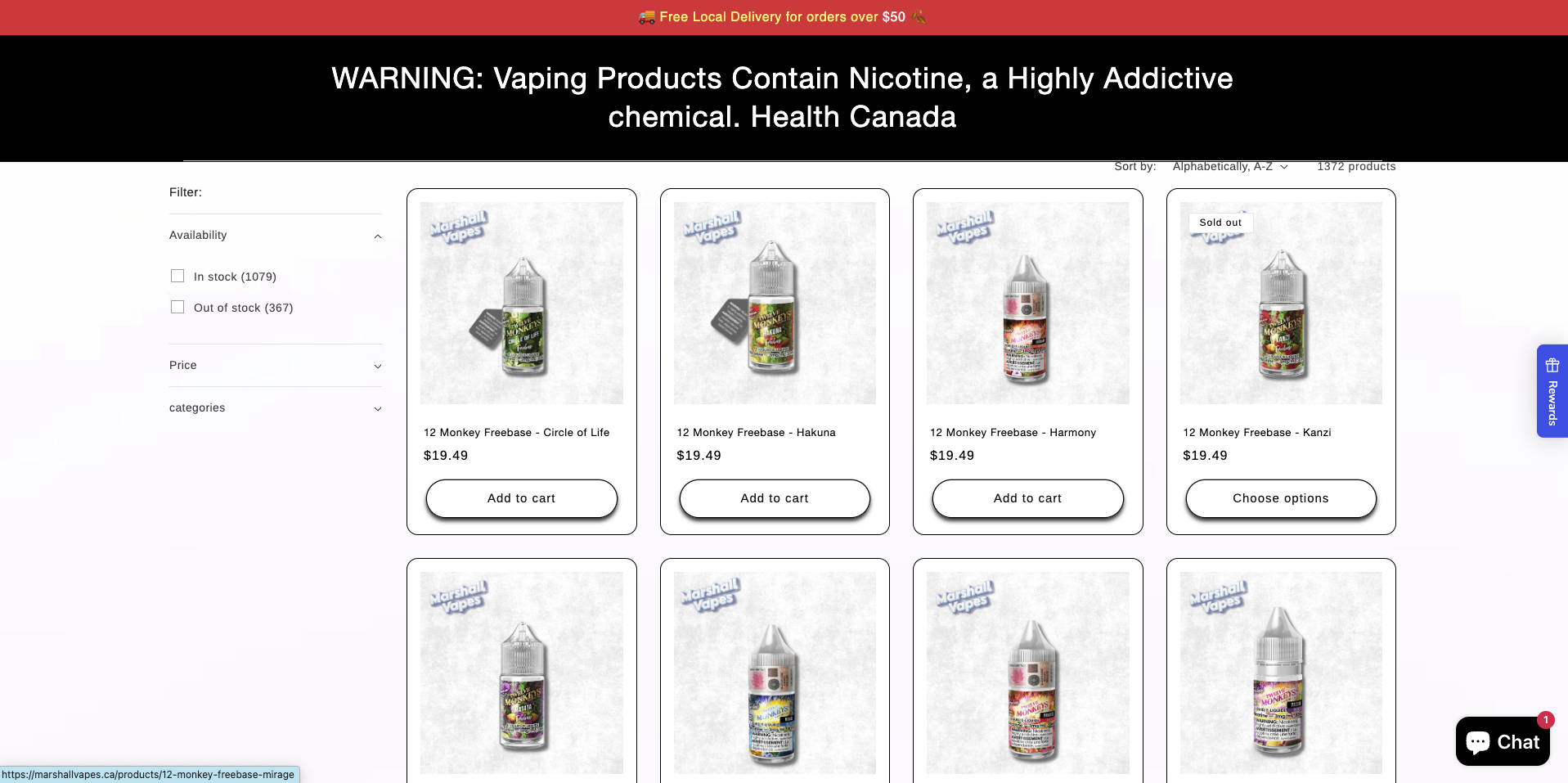
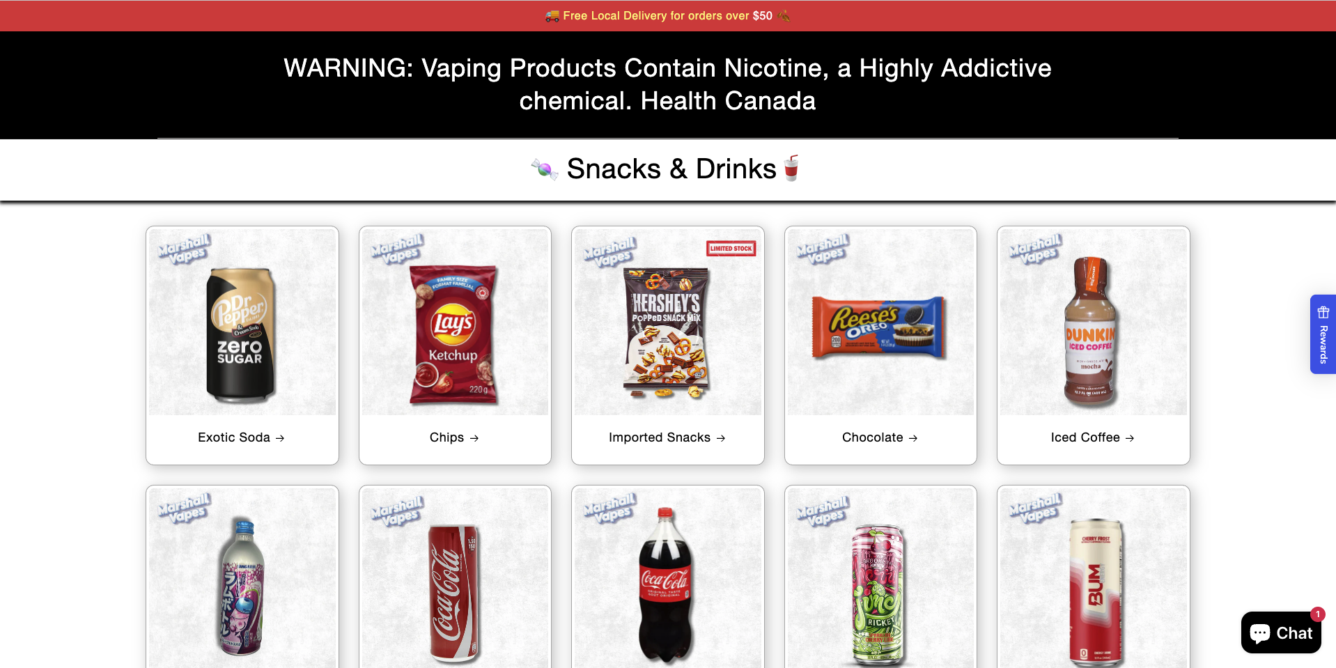
Structured the homepage into a repeatable hierarchy, hero promo → trending products → social proof → essentials categories → deeper collections. Built category groupings that match intent, Disposables, E-Liquids (Salt/Freebase), Pod Systems, and Deals.
Component System and Visual Consistency
Built reusable Shopify theme components for cards, carousels, and category grids to standardize spacing, typography, imagery, and CTAs. This improved consistency and made merchandising faster to maintain.
Feedback and Conversion Iteration
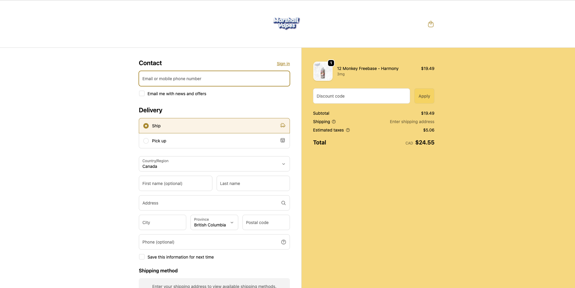
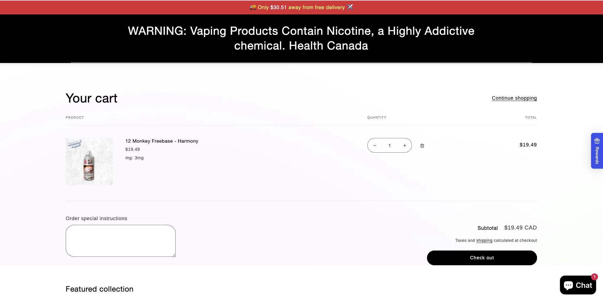
Used heuristic reviews, analytics, and session replays to find friction and iterate on navigation clarity, promo placement, and checkout confidence cues. These improvements contributed to a 15% lift in completed orders.
Color Scheme
Promo Red
#F23B38
Urgency, deal visibility, delivery incentives
Deep Black
#000000
Regulatory contrast, strong hierarchy
Warm Gold
#D4AF37
Checkout emphasis, premium accent
Charcoal Text
#1F1F1F
Primary readability, navigation, product info
UI Light Neutral
#F4F3F1
Clean browsing surface, product framing
Red surfaces promotions and delivery thresholds, black creates contrast for warnings and navigation, and warm gold adds a premium accent in checkout moments.
Typography
Aa Bb Cc
Heading
32–56px / SemiBold–Bold / Tight tracking
Body Text
16–18px / Regular / Comfortable line height
Section Label
12–14px / Medium / Uppercase tracking
Large bold headings create immediate hierarchy for promotions, while clean body text supports fast scanning across product grids and checkout flows.
Ecommerce design is behavior design. Each decision was made to lower cognitive load, increase information scent, and reduce hesitation during the path to checkout.
Conversion-Optimized Homepage Structure
A homepage flow that front-loads the promo message, then moves users into trending products, proof, and clear category entry points to shorten time-to-product.
Category-Based Shopping, Built for Intent
A "Vape Essentials" grid that mirrors how customers shop by format, Disposables, Salt, Freebase, Pod Systems, Deals, improving findability and reducing browsing friction.
Reusable Shopify UI Components
A modular component system inside Shopify theme architecture that keeps spacing, typography, CTAs, and card layouts consistent across the site.
Checkout Readiness Improvements
Conversion-focused tweaks informed by replays and heuristics, clarifying incentives, reducing uncertainty, and tightening the path into checkout.
Home screen
Trending vapes
Vape essentials
Bottle list
Snack list
Checkout flow
Checkout confirmation
See it live
MarshallVapes is live and growing. Check out the store.
Visit MarshallVapes