PackIt
Loading...
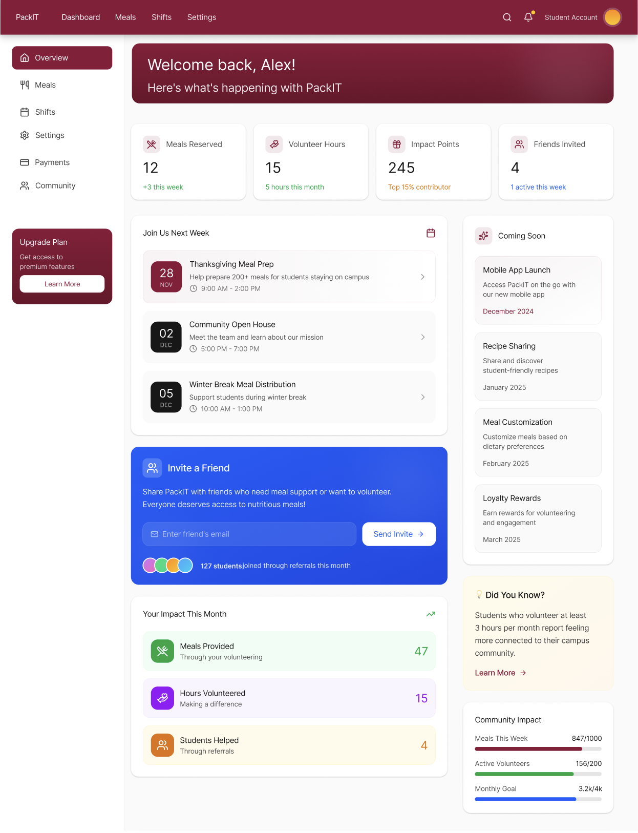
PackIt bridges the gap between institutions with surplus food and student volunteers willing to redistribute it. The project focused on creating intuitive user journeys for two distinct groups: donors posting available meals and volunteers coordinating pickups and distributions.
User Research
Conducted interviews to understand the pain points of food redistribution logistics, identifying key friction in how volunteers discover available shifts and how institutions post surplus.
Wireframing & Prototyping
Developed the product through a Figma-led prototype, utilizing Miro for brainstorming sessions and Adobe Creative Suite for asset generation.
Iterative Feedback
Moved from low-fidelity wireframes to high-fidelity mockups based on continuous testing cycles with real users from both donor and volunteer groups.
Data Validation
Validated primary user flows using simple data analysis derived from prototype testing sessions, ensuring the design addressed actual user needs.
Color Scheme
Primary Action
#9A0F3F
Community, urgency, action
Support Blue
#2457F5
Trust, security, system messaging
Soft Surface
#F7F5F4
Breathing room for cards and content zones
Deep Neutral
#1F1F1F
Readable text and interface structure
UI Neutral
#E9E6E4
Borders, dividers, and quiet backgrounds
A deep berry-red palette was chosen because it signals urgency and care, helping food redistribution actions feel human while keeping the interface clear.
Typography
Aa Bb Cc
Heading
32px / Bold / -0.02em tracking
Body Text
16px / Regular / 1.6 line height
Section Label
11px / Uppercase / 0.15em tracking
The hierarchy uses clear size and weight contrast to keep dashboards, meal flows, and settings easy to scan.
Built for speed, safety, and equity. Each decision reflects evidence on food safety, redistribution logistics, and student food insecurity.
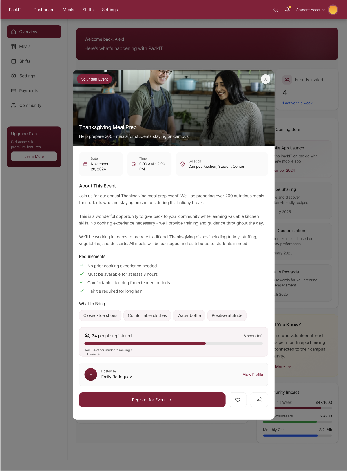
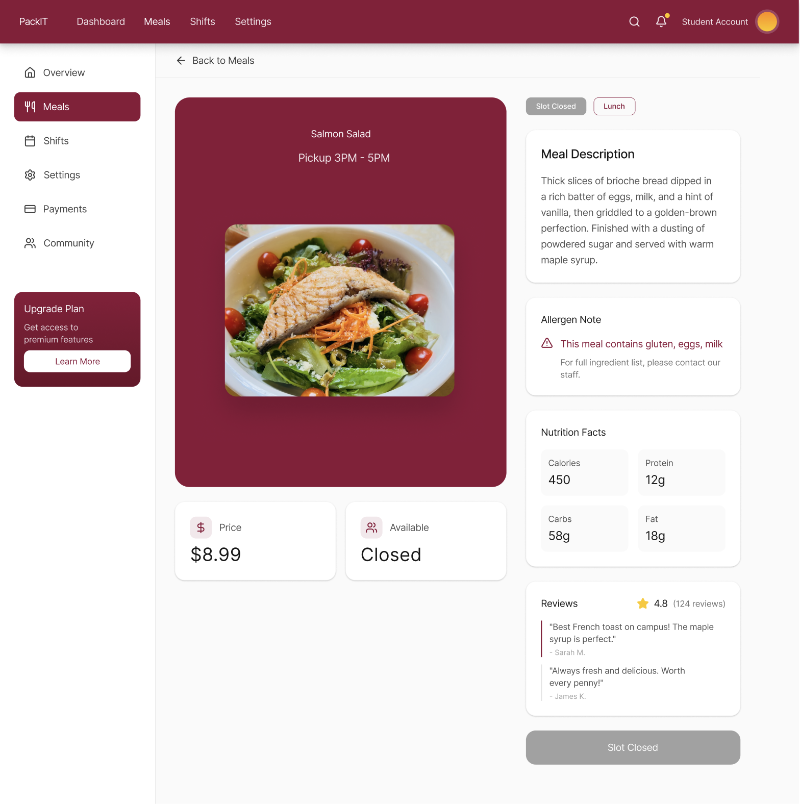
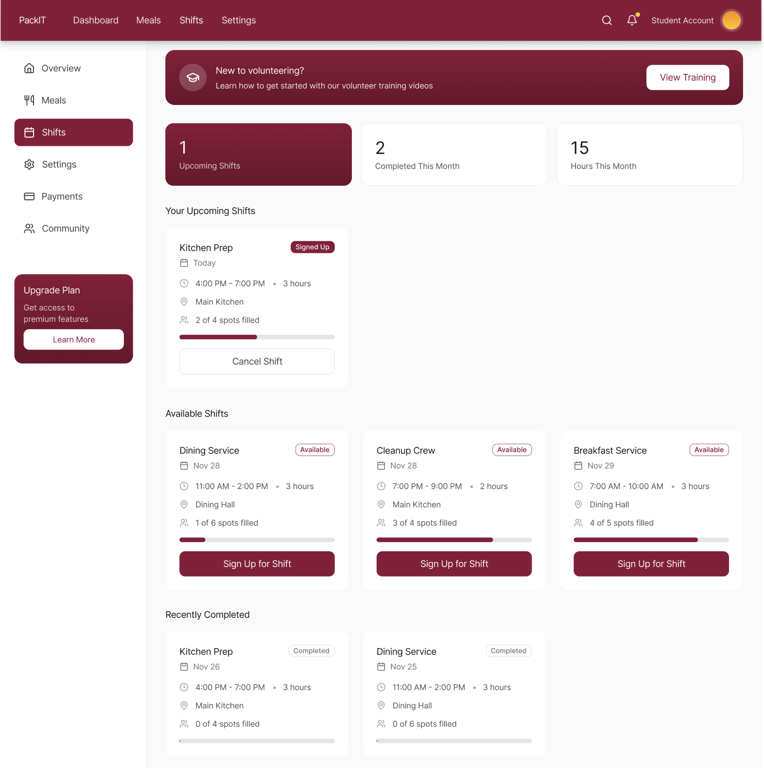
Streamlined Discovery
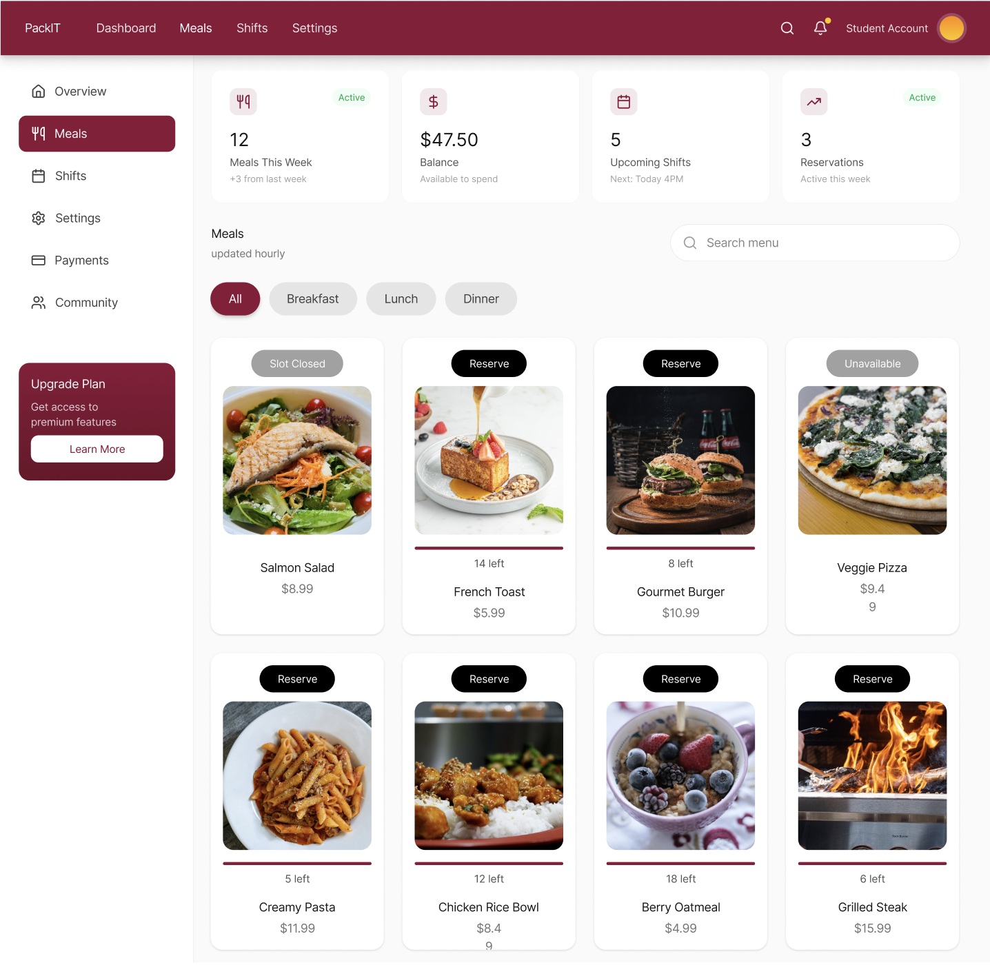
Mapped end-to-end user journeys that simplify how volunteers find available shifts and how institutions post surplus. The dashboard surfaces the most relevant opportunities first.
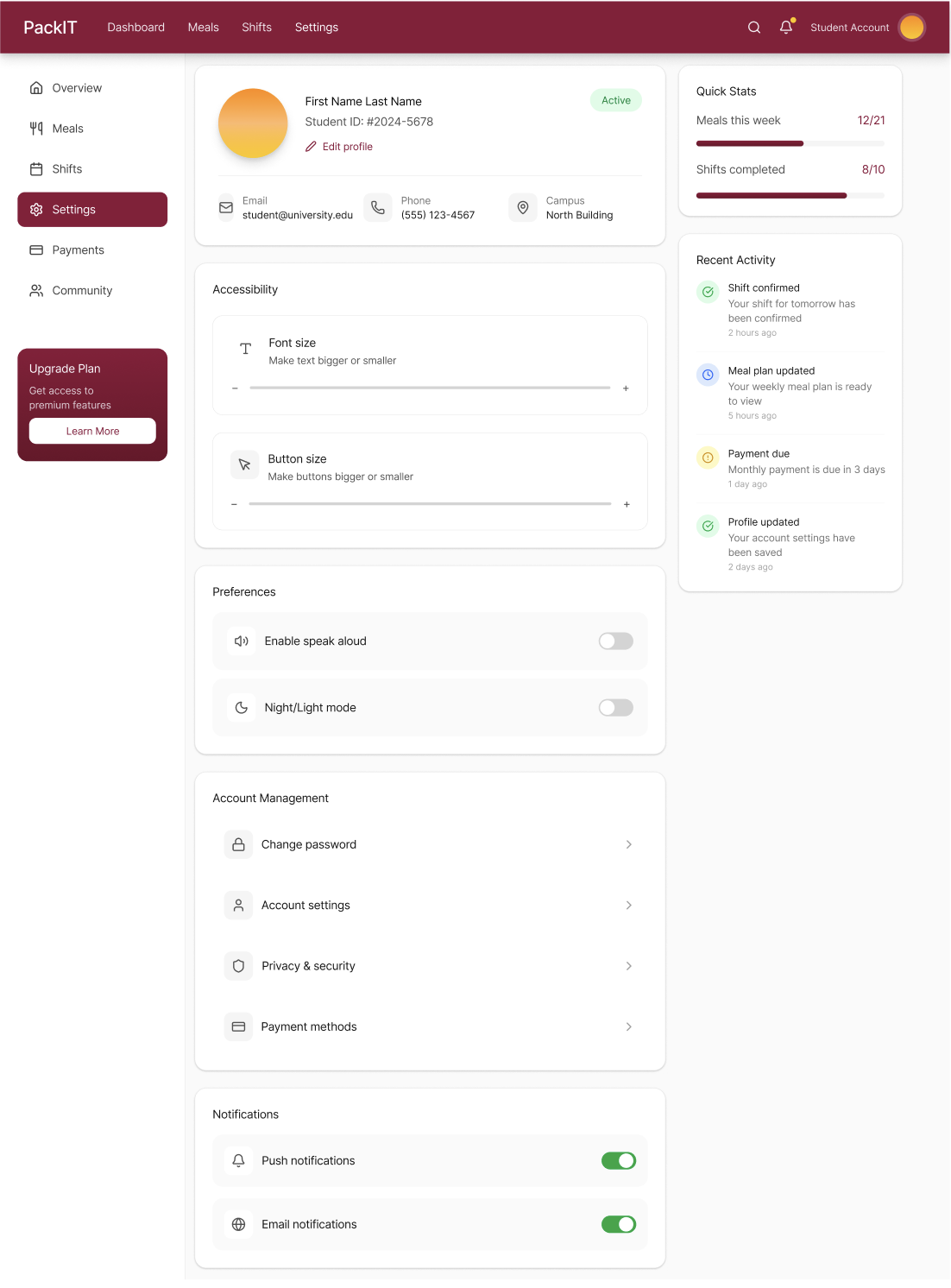
Accessible UI
Designed with accessibility in mind, ensuring the interface is usable for a diverse range of users in high-paced environments like campus dining halls and distribution centers.
Dual User Flows
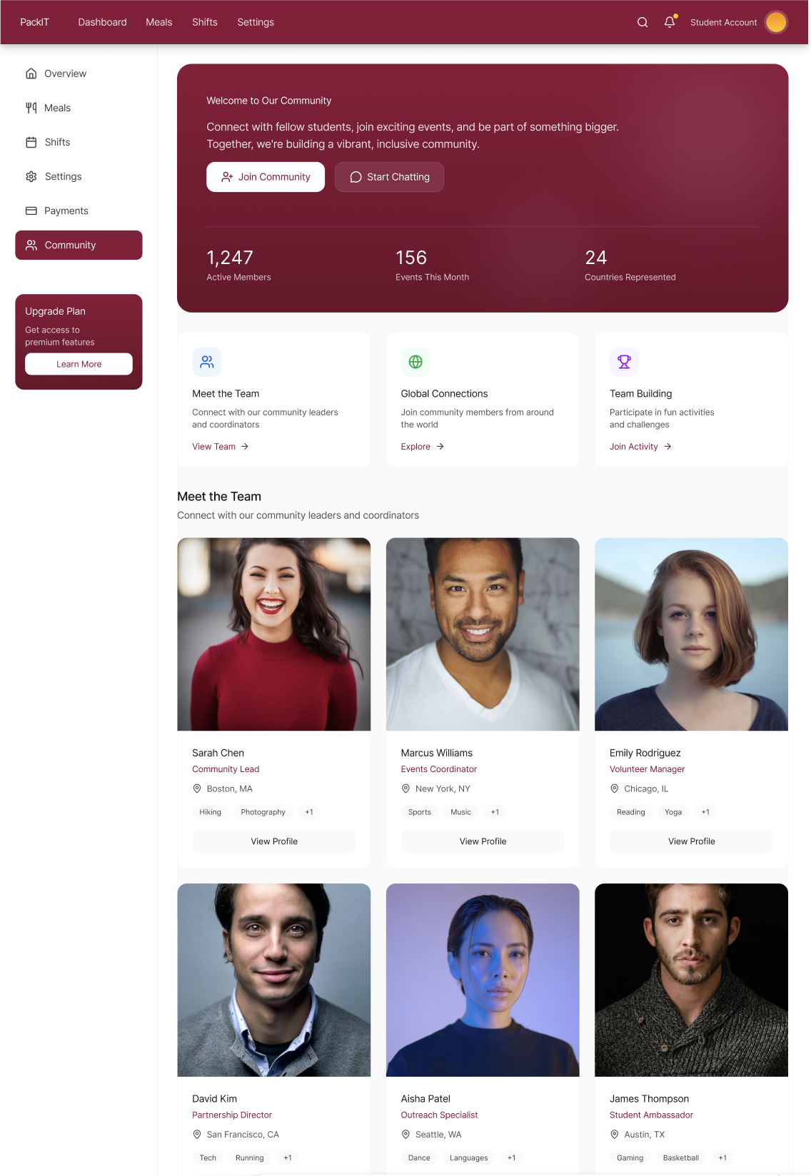
Separate but connected experiences for students seeking meals and staff managing distribution, with clear handoff points and status tracking throughout the process.
Main dashboard
Community screen
Volunteer sign-up
Settings screen
Meal screen
Meal details
Shifts screen
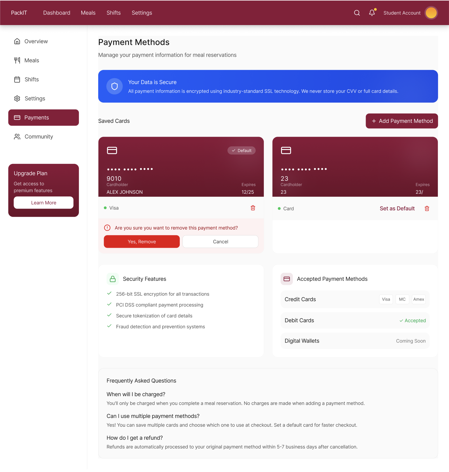
Payment checkout
Interested in the design?
Explore the full Figma prototype and design system.
View in Figma